[01] ABOUT THE PROJECT
SHAPING A BETTER
EXPERIENCE
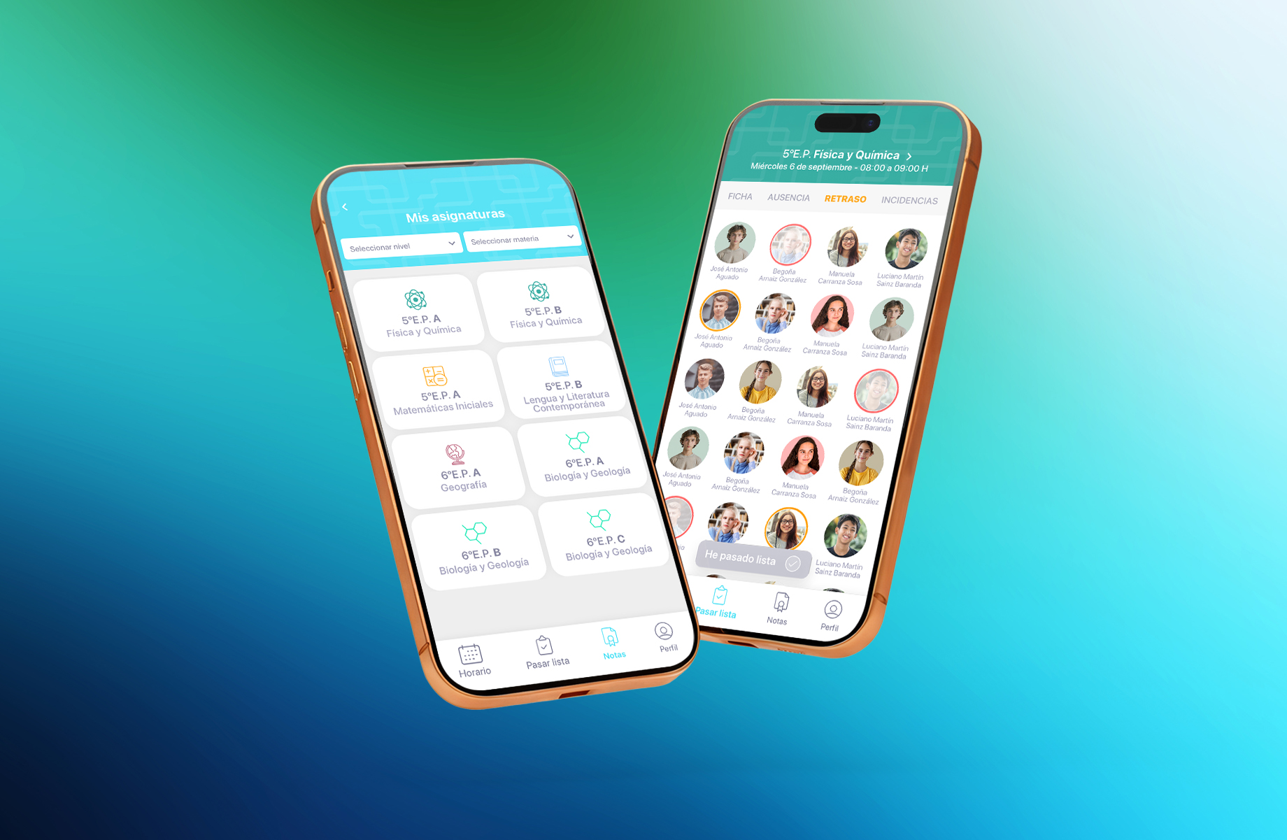
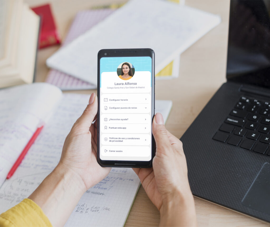
The project started from a clear usability issue: the existing app was not functioning properly, its interface was confusing, and the overall experience was negatively affecting users instead of helping them. The main objective was to turn a problematic tool into a simple, intuitive and reliable digital product.
One of the key challenges was the diversity of users. The app had to work equally well for teachers who are highly familiar with technology and for those with low digital confidence. This required a strong focus on accessibility, clarity and ease of use, ensuring that the experience felt natural for all user profiles without limiting functionality.
[02] PROJECT GOALS
The UX process began with a detailed analysis of the previous version to identify pain points, usability barriers and critical friction points. Navigation flows were restructured, the information architecture was simplified and the most frequent tasks were prioritized. The goal was to reduce cognitive load, eliminate unnecessary steps and streamline everyday actions.
[03] CONCULSION
CRAFTING UNIQUE SOLUTIONS WITH PRECISION AND PASSION.
[ APPROACH ]
From a UI perspective, the visual system was redesigned to feel clean, friendly and trustworthy. Typography, spacing and visual hierarchy were carefully defined to improve readability and guide users intuitively through each screen. Consistency across components was essential to build confidence and make the interface feel predictable and easy to learn.
Throughout the entire process, the design decisions were guided by real usage scenarios, where time is limited and clarity is essential. The final result is a more inclusive, efficient and user-centered application that improves the digital experience for teachers and supports them in their daily work.